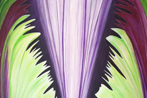
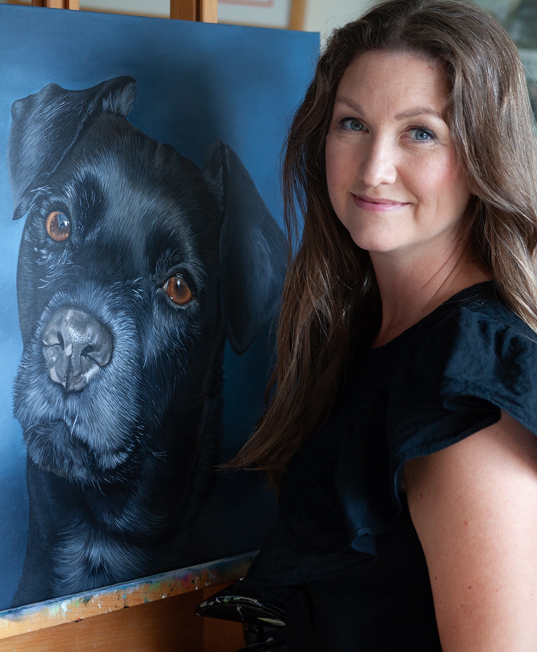
I’ve been working on so many large paintings lately I figured I needed one for my exhibit down in Richmond during January and February. For those of you who are fans of Studio Eriksdotter on facebook may have seen my outreach for help last weekend when I just couldn’t figure out what background color the large painting should have. Thank God for fans – you guys really helped me out!
Thank you everyone! I thought the suggestions were really great! I had been thinking about gray the whole time I was painting but it just felt too dark and heavy when it was getting closer to being done. I needed a lighter, lovelier color but I just didn’t know which one. White felt a little too harsh, though I’m a fan of white backgrounds… I ultimately went with Linn’s suggestion of picking a light color I had already used in the painting – either light green or light purple.
So which background color did I pick?

You’ll have to wait until 2011 to find out!
Happy New Year!
xo,
e.


